[v.1.1] (08/15/2023): Source code published!
[v.1.0] (05/27/2023): Post published!
Recently, I had an opportunity of joining the Mathbridge project, led by Virginia Tech’s Computer Science Department. Our goal was to develop a data visualization web application that serves as an interactive playground for students to explore and visualize concepts related to linear algebra and machine learning algorithms. This project holds particular significance for my university, which has a strong focus on machine learning and regularly produces groundbreaking research in the field. By creating this website, we aim to attract students and provide them with a valuable resource for their ML-focused programs. I’m delighted to announce that we have successfully deployed the prototype of the website, and we are continuously working on adding additional stylings, ML algorithms, and expanding the tech stack to enhance the user experience. Stay tuned for regular updates as we evolve and improve this exciting project.
Starter code can be found here.
Architecture
The web application we have developed follows the single-page application (SPA) architecture, allowing for real-time updates and seamless user interactions. While there are popular SPA frameworks like Vue.js (open-sourced by Evan You), React (open-sourced by Meta), and Angular (open-sourced by Google), for this project, I made the decision to use Dash, a Python framework specifically designed for creating analytical web applications.
Dash combines the best of both worlds, incorporating elements of React and Flask API. It leverages Flask’s backend infrastructure to handle HTTP requests and responses while providing responsive components that enable dynamic interactions with the user.
Now, why did I choose Dash? My introduction to this powerful tool came through the CS-5764: Information Visualization class, where I learned about its capabilities. Additionally, Dash offers a strong integration with Plotly, a widely-used visualization library (often seen on platforms like Kaggle), which allows for the creation of interactive plots. The reactive nature of Dash simplifies development by automatically updating visualizations when data or inputs change, similar to web-hooks.
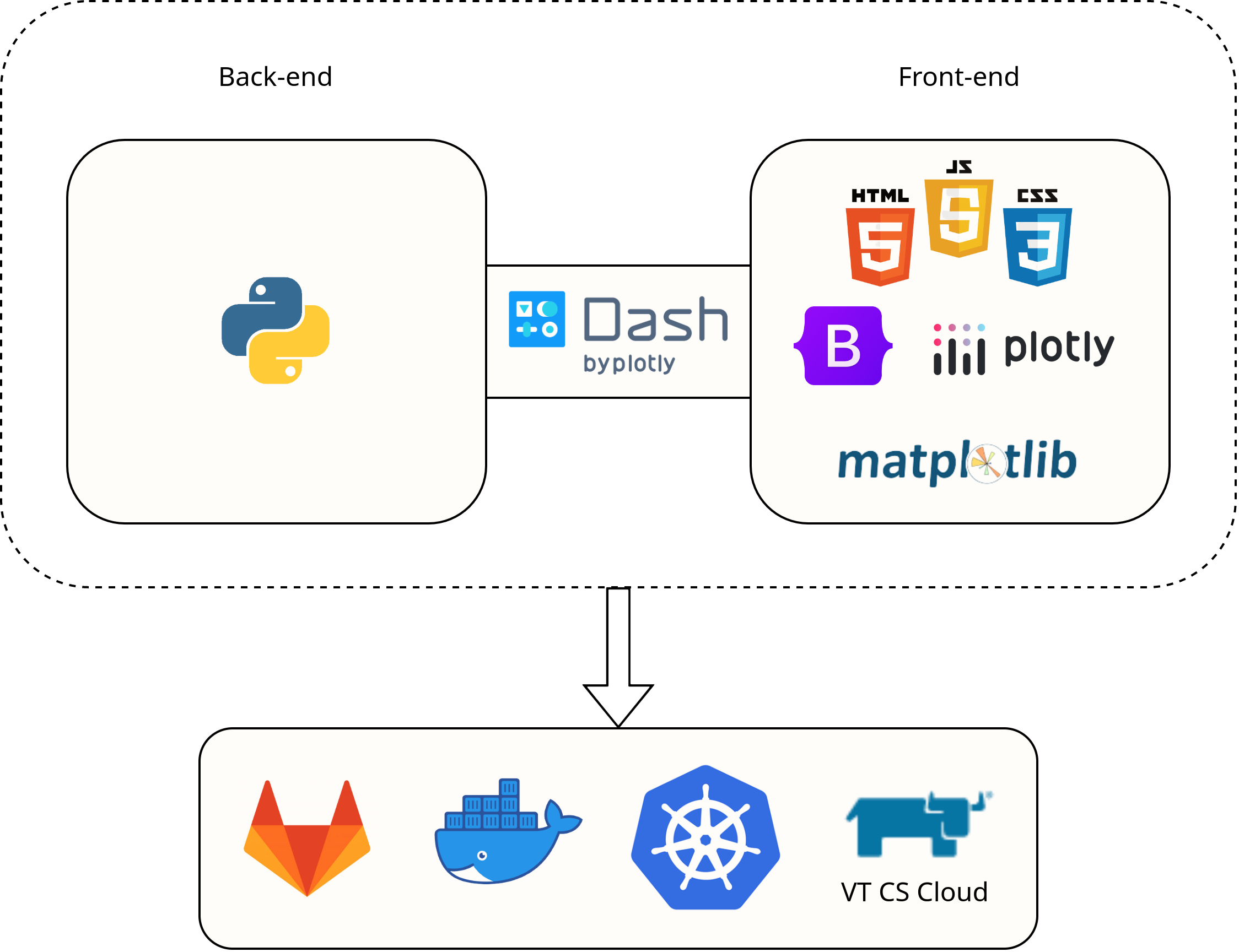
Front-end
To build the interactive visualizations, I utilized Dash Core Components (DCC), which provides a way to define HTML layouts in Dash, styled with CSS. As the project progresses, I plan to gradually integrate Dash Bootstrap Components (DBC) to further enhance the styling and overall user experience.
Back-end
Dash’s powerful callbacks are a key component of the back-end infrastructure. These callbacks connect user input to the appropriate functions and facilitate real-time updates of visualizations, calculated values, or any other types of output. To handle data manipulation and analysis, I leveraged popular data science libraries such as NumPy and Pandas. It’s worth noting that, at present, there is no database integration in this project.
By leveraging Dash’s reactive components and powerful callbacks, we have created an intuitive and interactive web application for visualizing linear algebra and machine learning concepts. The combination of Dash’s front-end capabilities and Flask’s backend infrastructure, along with the seamless integration with Plotly, has made development efficient and enjoyable.
Deployment
To ensure consistent performance across different environments, I utilized Docker for containerization. Docker effectively addresses the issue of “it works on my machine but not on yours.” By using Docker, I created containers that provide isolated and reproducible environments for my application. The Dockerfile served as the blueprint for building a Docker image, and the Docker container acted as the runtime instance of that image.
To make the deployment process more convenient, I pushed the built and tested Docker image to Docker Hub. Docker Hub serves as a centralized registry where the image can be easily accessed. This streamlined the deployment process, allowing for effortless deployment on various machines and environments without the need for manual image transfers or sharing through other means.
Why did I switch from using DockerHub to GitLab? I encountered rate limits on Docker Hub and had concerns about the security of my pushed images. As a solution, I switched to using GitLab Container Registry. GitLab Container Registry, integrated within my GitLab projects, provides a secure and scalable alternative for storing and managing Docker images. This shift allowed me to overcome rate limiting restrictions and gain more control over the security and accessibility of my Docker images. I could now push the Docker images to GitLab Container Registry and subsequently pull them from there for deployment on my target environments.
For scalable deployment and management, I turned to Kubernetes, a powerful container orchestration platform. By leveraging Kubernetes, I could effectively manage and scale my web application based on demand. With features like pods and load balancing, Kubernetes enabled the website to achieve high availability and efficient resource utilization. To deploy the website, I utilized Virginia Tech’s cloud service. Both the Kubernetes web interface and the KubeCTL command line tool were employed for managing the deployment, ensuring flexibility and ease of use.
Through the utilization of Docker for containerization, GitLab Container Registry for image storage and management, and Kubernetes for scalable deployment, I have established a robust and efficient deployment process for the web application. This combination of technologies allows for seamless and reliable deployment across different environments while ensuring optimal performance and security.
In conclusion, our data visualization web application built using Dash has laid the foundation for an exciting and interactive learning platform for students and enthusiasts of linear algebra and machine learning. The project’s journey has been filled with learning opportunities and significant milestones, and we are committed to further enhancing the application as it evolves.
One aspect we will focus on is improving the user interface and overall user experience. By gradually incorporating DBC, we aim to create a visually appealing and intuitive interface that enhances user engagement and interaction. The addition of styling elements will contribute to a more polished and professional look, making the application even more inviting for users. Furthermore, we plan to introduce more advanced ML algorithms to the application. By leveraging the power of popular data science libraries such as NumPy and Pandas, we can integrate cutting-edge algorithms that enable users to explore and experiment with various machine learning techniques. This expansion will provide students with a hands-on experience in applying ML concepts and foster a deeper understanding of the subject matter.
Citation
Cited as:
Nguyen, Minh. (May 2023). Building a Data Visualization Web App with Dash https://mnguyen0226.github.io/posts/mathbridge/post/
Or
@article{nguyen2023webdash,
  title   = "Building a Data Visualization Web App with Dash",
  author  = "Nguyen, Minh",
  journal = "mnguyen0226.github.io",
  year    = "2023",
  month   = "May",
  url     = "https://mnguyen0226.github.io/posts/mathbridge/post/"
}
References
[1] “Gitlab documentation,” GitLab Documentation, https://docs.gitlab.com/ (accessed May 26, 2023).
[2] “Command line tool (kubectl),” Kubernetes, https://kubernetes.io/docs/reference/kubectl/ (accessed May 26, 2023). [3] “Kubernetes Documentation,” Kubernetes, https://kubernetes.io/docs/home/ (accessed May 26, 2023).
[4] “Docker docs: How to build, share, and run applications,” Docker Documentation, https://docs.docker.com/ (accessed May 26, 2023).
[5] “Dash documentation & user guide,” Plotly, https://dash.plotly.com/ (accessed May 26, 2023).